|

ChrisO's alternative
MykReeve's alternative

|
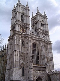
This is stunning, formidable, soaring, and very impressive. The gray London sky is a complement. Created by ChrisO. --Merovingian✍Talk 17:14, Jul 27, 2004 (UTC)
- Support (original). Greudin
- Oppose (original). This picture, while technically fine, is not outstanding enough to be featured. Its just kind of blah. Theon 16:33, Jul 28, 2004 (UTC)
- Support (original) - Bevo 22:06, 28 Jul 2004 (UTC)
- Oppose (original). Composition is great, and the sky interesting, but the (all too common) diffuse lighting afforded by the ever-cloudy Londongrad sky makes for an unappealing overall tonal sameness (which is dweebspeek for "blah"). The same photo taken on a relatively clear day (forecast for this weekend looks excellent, btw) in the early morning / late evening time (when tangential light should pick out the detail better) would be excellent. -- Finlay McWalter | Talk 00:49, 29 Jul 2004 (UTC)
- OK, I'll have another go to see if I can capture it in different lighting. :-) -- ChrisO 07:38, 29 Jul 2004 (UTC)
- I'd like to see any new photos, but I still like the (original) one nominated, for exactly the reasons that Merovingian✍Talk presented - Bevo 18:26, 29 Jul 2004 (UTC)
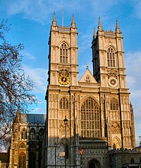
- Support (alternative, but not original). The top of the left-hand tower is included in the alternative image, and it appears straighter too. - MykReeve 18:58, 30 Jul 2004 (UTC)
- I've just found this old one that I took of the Abbey on a Summer evening after work in 2002 which might serve as an alternative, as it has a contrasting blue sky behind, is a larger image, is taken from a more central viewpoint, and shows the full west front down to the ground. Eagle-eyed viewers will also spot the top of the Clock Tower of the Palace of Westminster peeking into the lower-left hand corner of the image. - MykReeve 15:17, 29 Jul 2004 (UTC)
- I did consider using this viewpoint but decided against it for two reasons: the column and Clock Tower makes it too cluttered (as well as detracting from the facade) and a square-on view always seems to me to be too "flat". I much prefer a viewpoint that shows a bit of what's behind the facade - it adds depth. -- ChrisO 19:29, 30 Jul 2004 (UTC)
- Those are valid points - given that the column in front is unremarkable, and your photos do show the depth behind the facade. I'm sticking to my support for the alternative, but not the original image. - MykReeve 18:50, 1 Aug 2004 (UTC)
- Support (original). I really like this photo. It's just a shame that the very top of one of the towers seems to be cropped off. Randyoo 22:42, 29 Jul 2004 (UTC)
- Support (original) - I like it and the gray clouds make it exceptional IMHO. --Buster 22:45, Jul 29, 2004 (UTC)
- Comment - I still like the original best, it seems to show the details the best. Although the more I look at it, I am really bothered that the tower tip was cropped off, I blame Randyoo for making me notice that. --Buster 08:20, Jul 31, 2004 (UTC)
- I've provided an alternative image from the same viewpoint, taken on a bright summer's day, with direct lighting of the abbey facade and the left-hand tower's tip no longer cropped. I've tweaked the votes above to make it clear which image is being voted on. If anyone else votes could they please do likewise? -- ChrisO 07:56, 30 Jul 2004 (UTC)
- Oppose (All). None of these stand out particularly. More interesting light, or some extra element, such as weather, or surroundings, some sort of framing, might make a more impressive photo. Peregrine981 15:48, Aug 1, 2004 (UTC)
- Oppose. I would prefer to see more of the base of the structure as well as the top. Also, the colours present don't really catch my eye Enochlau 14:12, 2 Aug 2004 (UTC)
- Might I humbly suggest my one? It's taken in the evening, so the normally rather dull stonework looks somewhat warmer, and the northern transcept is shown in the background; sad that the flag wasn't flying, though (in any of them)... James F. (talk) 15:44, 3 Aug 2004 (UTC)
- Original - Not promoted. +4 -5 - Bevo 02:08, 12 Aug 2004 (UTC)
- First alternative - Not promoted. +1 -1 - Bevo 02:08, 12 Aug 2004 (UTC)
- Second alternative - Not promoted. +0 -0 - Bevo 02:08, 12 Aug 2004 (UTC)
- Third alternative - Not promoted. +1 -0 - Bevo 02:08, 12 Aug 2004 (UTC)
|


